THE BASICS OF COLOR AND INTERIOR DESIGN
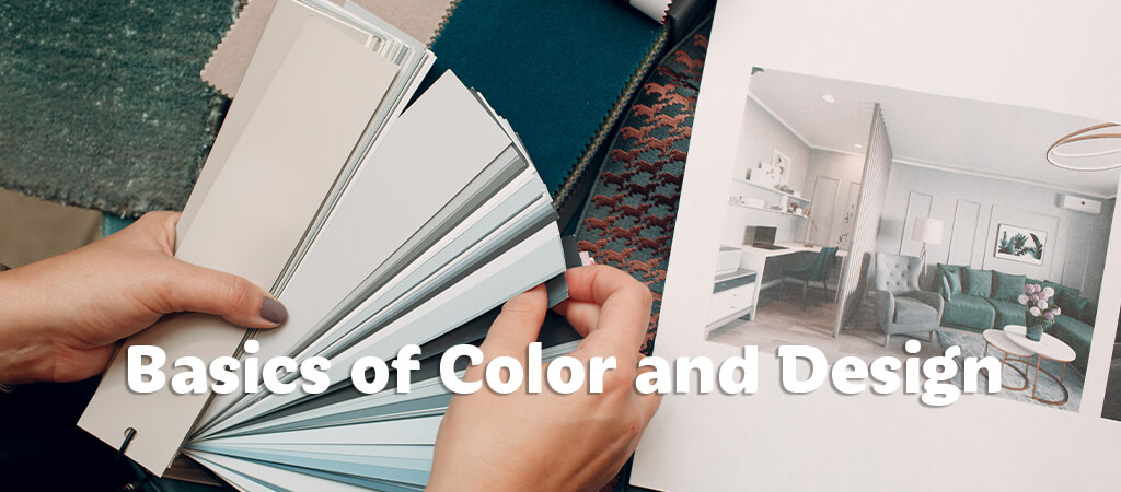
Choosing a suitable color scheme for a room can seem daunting when it comes to interior design. If you’re unsure which colors to use where you can feel at ease knowing there’s a solution. Thankfully, multiple interior design rules can make the process simple. Here are some handy design rules to help you understand the basics of matching colors.
COLOR THEORY
The first and arguably most important design rule to remember is color theory. This concept is the basis of understanding colors and pairing them well within interior design. More specifically, color theory is the science behind which colors work well together and the art of putting them together pleasingly. Color theory is imperative for harmonizing colors that create ambiance and mood in a room. Establishing the color theory is possible through comprehension of the color wheel.
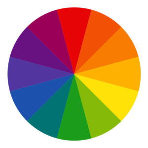
If you took an art class growing up, you might be vaguely familiar with the color wheel. The color wheel comprises three types of colors. Red, blue, and yellow are the primary colors that form the foundation for all other colors. Secondary colors are made by combining primary colors, and include purple, green, and orange. Lastly, tertiary colors combine primary and secondary colors in different aspect ratios. Examples include vermillion, amber, chartreuse, teal, violet, and magenta.
Each color has hues made by combining them with white, gray, or black. These are tints, tones, and shades, respectively. It can be hard to recall all these colors, but there’s nothing wrong with using a handy color wheel site to keep track. Specific colors work in unison with each other; these combinations are color schemes.
A color scheme is where theory and practice meet. Using a color scheme will help you achieve the proper aesthetic for an area of your choosing. There are endless color combinations, and color schemes are your organization tool for the job.
There are six types of color schemes to choose from:
- A monochromatic scheme uses a variety of hues from the same base color to create pleasing themes.
- Analogous color schemes pick from colors next to each other on the color wheel, a good example being a green-teal-blue scheme.
- Complementary color schemes use colors on the opposite side of the wheel to bring out the best of each.
- Triadic color schemes employ hues that are equally spaced from each other, creating a triangle shape on the wheel.
- Split-complementary color schemes use two sets of colors from complementary sides of the wheel for four unique yet flattering types.
- A tetradic color scheme adds another color to the triadic mix, creating a rectangular shape instead.
COLOR TEMPERATURE AND EMOTION
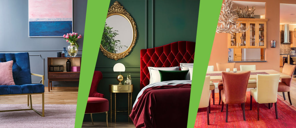
Colors do more than brighten a room; they can also elicit certain tones or moods. Another art class favorite comes in color temperature. With this, the color wheel divides into warm and cool temperatures. Warm colors are based on reds and yellows, while cool colors are blues and greens. Both have their place in interior design, but neither should overpower the room. It can create an unpleasant exposure and damage the mood overall.
On the topic of color mood, considering the emotion that each color can evoke is pertinent to the design process. It is known as color psychology, a theory of how colors affect a person’s mood, creativity, productivity, and general awareness. Different hues have a scientific effect on the mind, so picking something that matches your personality is integral. Red encapsulates love, passion, and energy. However, it can also inspire anger, so adding calming nuance will balance a room. Yellow inspires happiness, intelligence, and productivity. And green can provoke nature, peace, and calmness. Each color has a range of emotions to convey, and mixing them in proper amounts can give a truly unique aesthetic.
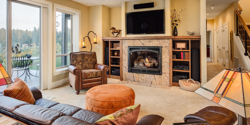
THE 60-30-10 RULE
At this point in the interior design process, you’ve gained an understanding of the perfect color schemes to use and the meaning behind each color. But a question remains: how much of each color do you use? That’s where the 60-30-10 rule comes into play. The rule is a time-honored solution to divide a color scheme into the appropriate percentages of color use. The main color of your scheme should represent 60% of the color in the room. It acts as the base of your design and should be prominent on walls or furniture. Your secondary color should make up 30% of the design and acts as a foil to your main color. It helps create depth and interest in your décor as a result. The final color is an accent and includes 10% of the color design. It will add greater contrast and depth to the room, smoothing out the aesthetic flow.
THE RULE OF THREE
You may have noticed that many of the design rules until now deal in threes. That’s because The Rule of Three holds weight in many topics, such as interior design and storytelling. The reason is that three is the first number that creates distinguishable patterns. Furthermore, odd numbers force the eyes to move around and experience more in a scene. Overall, odd-numbered objects are more memorable and appealing than even-numbered groups. Using three colors when designing will create exciting and balanced decor. Use it to your advantage, but don’t feel limited! As stated, any odd number will elicit a similar response.
We hope this has been an enlightening and helpful tutorial on the mechanics of color and design. Join us next time as we review how to coordinate color and interior design throughout your home!